宮崎で多くの方に親しまれてきた「宮崎国際音楽祭」のデザインを担当させていただきました。
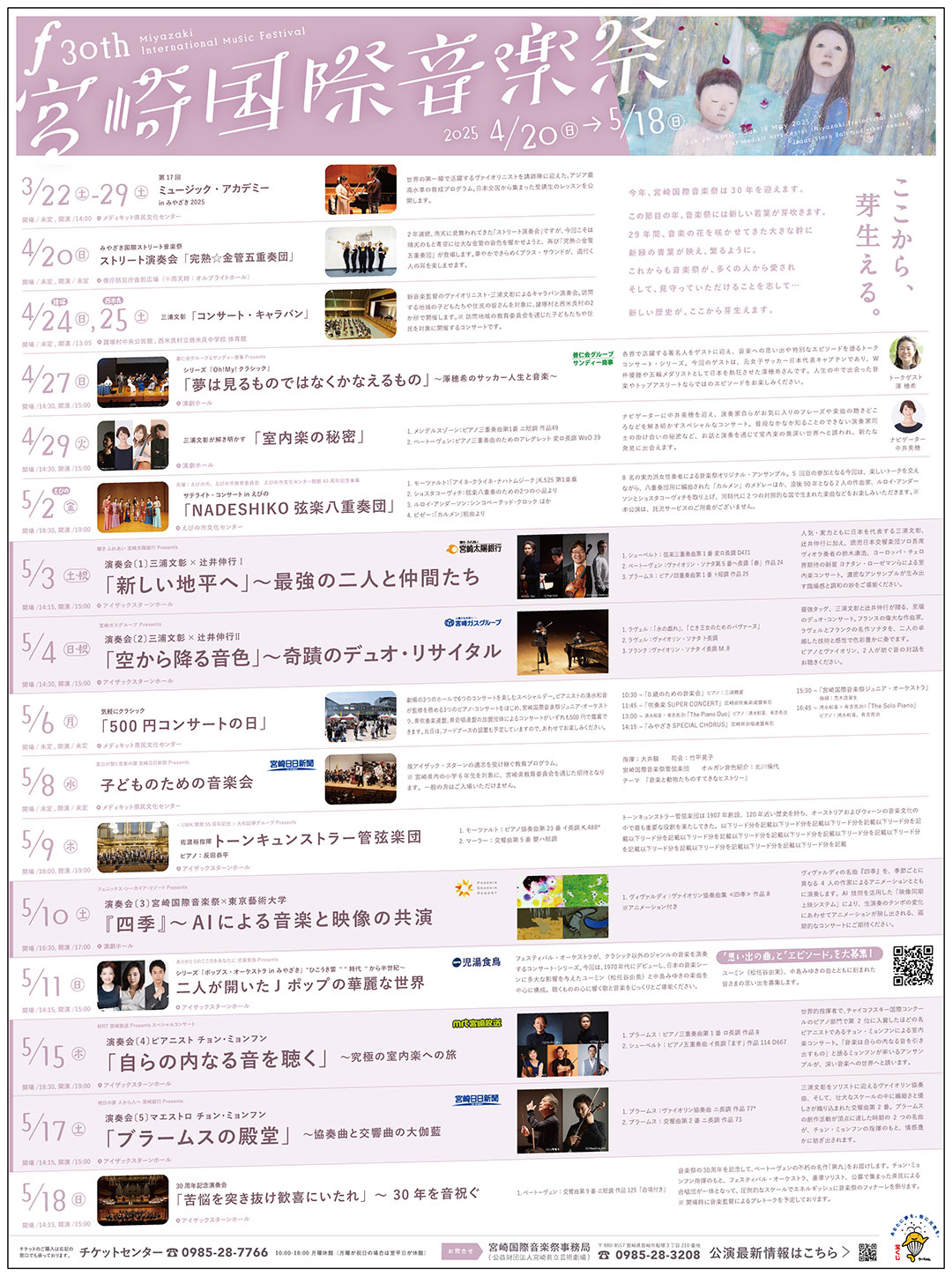
30回という節目を迎え、十二分に成熟した音楽祭。訪れる観客は高齢化し、次の世代へとつながっていくための大切な節目のデザインは、これからはじまる新しい30年への明るい予感を感じさせつつ、「おごそかなコンサート」から「盛大な年に一度の音楽祭」として、若い世代の方々に足を運んでもらえるようなデザインが求められました。
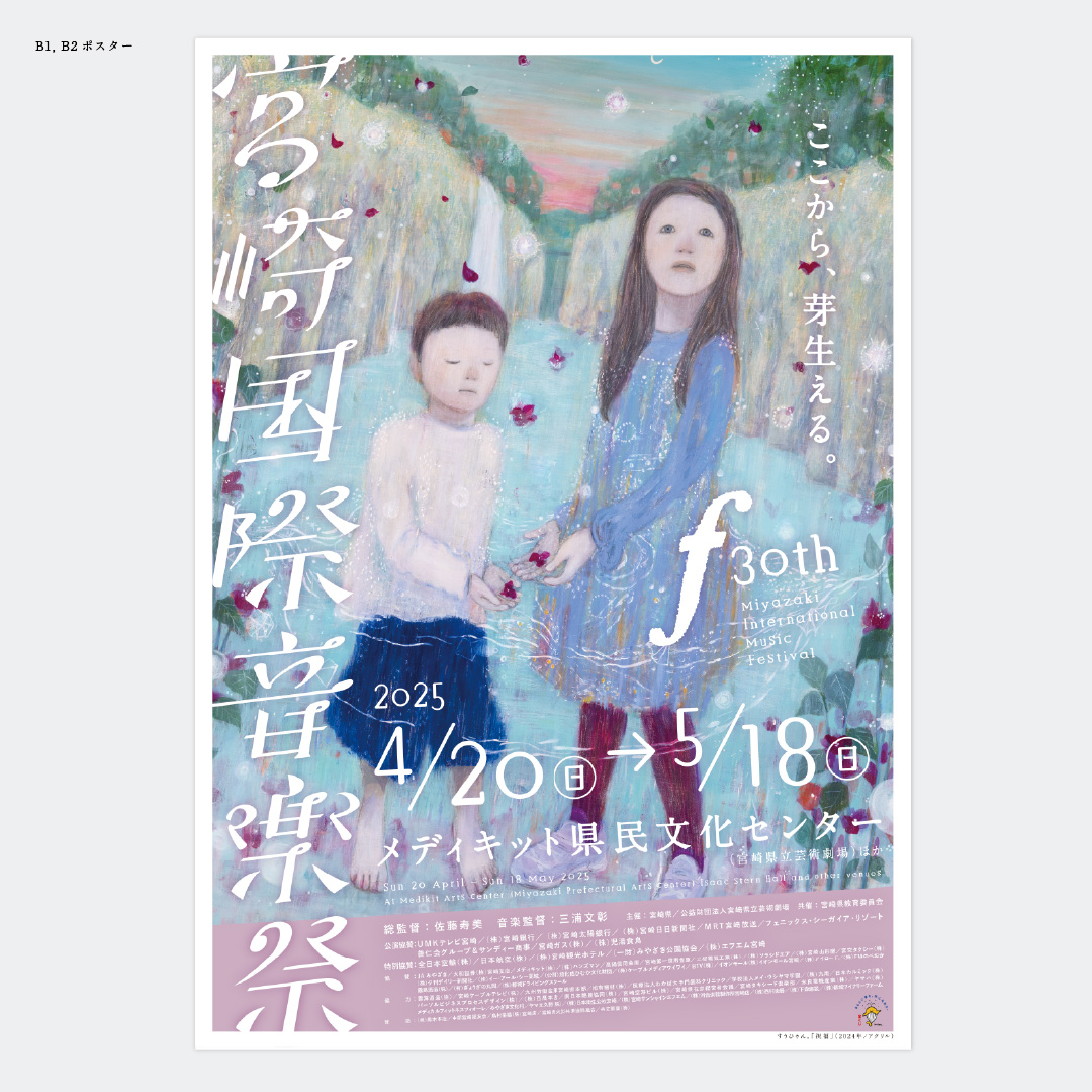
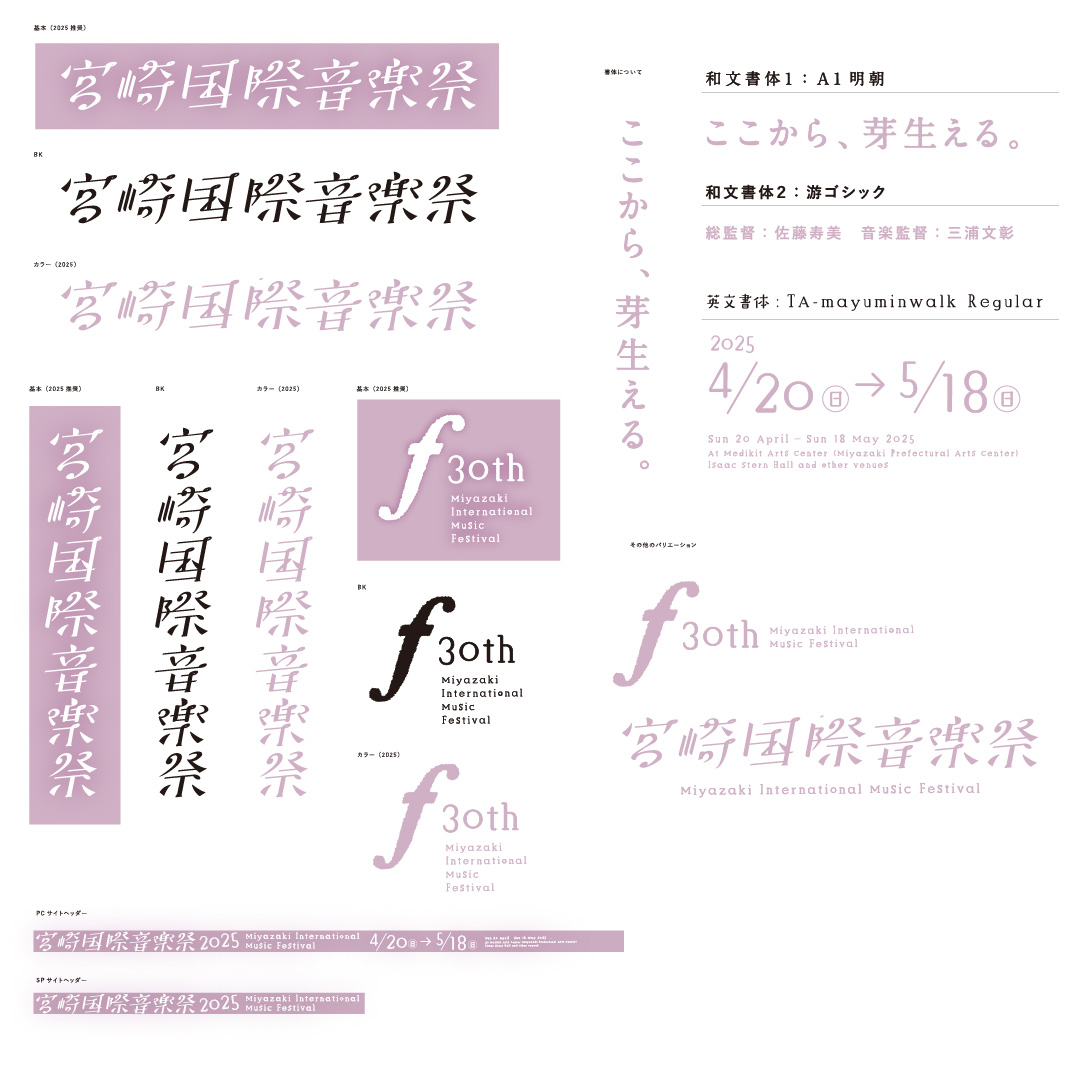
画家である「すうひゃん。」さんの絵を使用してビジュアルを構築していくうえで、まずタイポグラフィーからとりかかりました。「宮崎国際音楽祭」という漢字の羅列は、どうしても堅苦しい雰囲気になり、かといって英語にして「Miyazaki Music Festival」にしても直感的に認識できない。
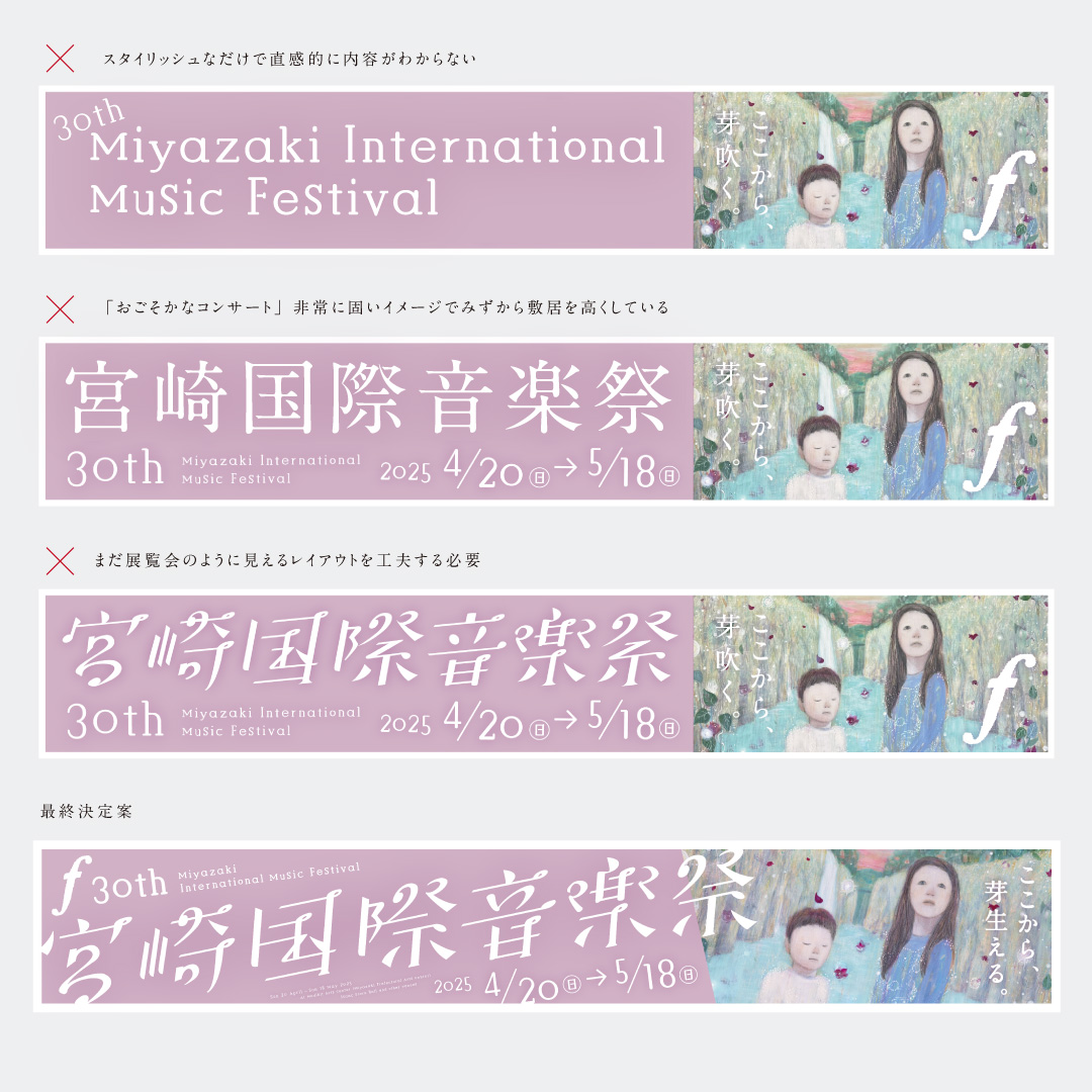
直感的に認識できる漢字でありながら、やわらかい雰囲気、さらに盛大な音楽祭というアクティブなタイポグラフィーを開発しました。
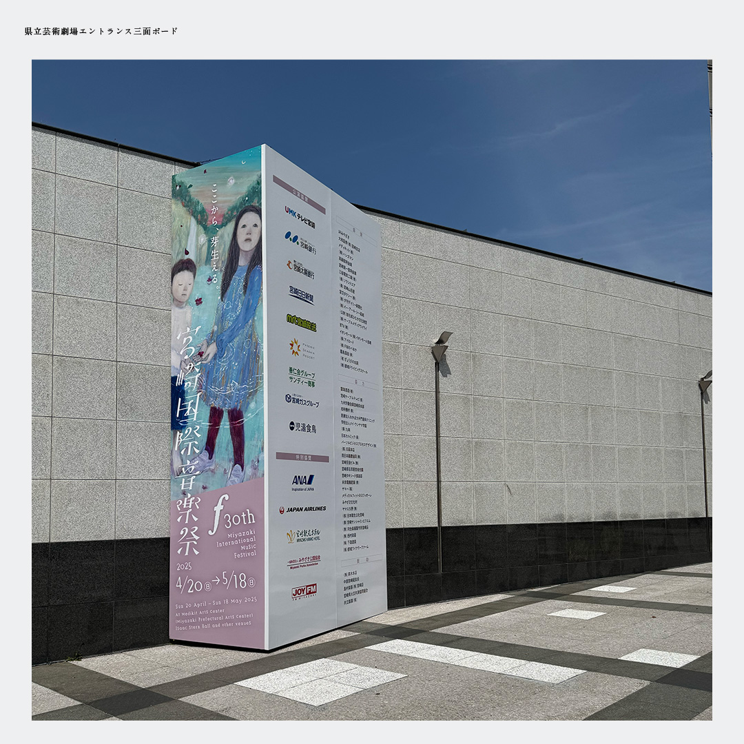
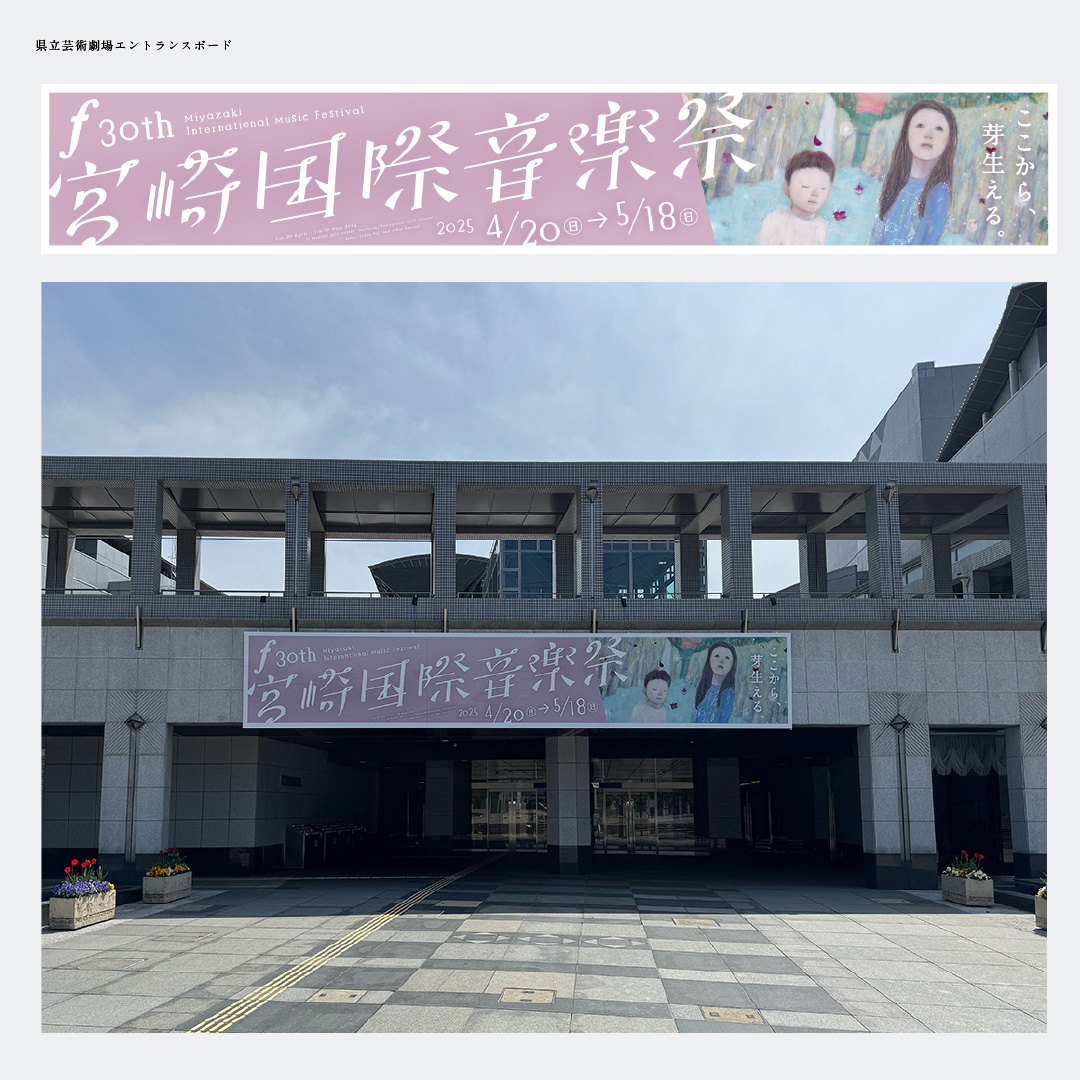
こうした音楽祭のメインビジュアルに使用するのは通常「イラストレーション」ですが、アート作品をどれだけデザインレイアウトに落とし込めるかが、もっとも困難なところです。アートをトリミングしたり斜めにしたりするのは紛れもなくタブー。しかしこれを守っていては、アートのもっているネガティブな部分が前面に出てしまうばかりか、音楽祭ではなく展覧会になってしまいます。
自分の中に法律のように横たわっていた「アートの取説」をとりはらい、「イラストレーション」として大胆にトリミングをしました。さらに斜めに配置することで勢いをつけ、「盛大な音楽祭」としてのビジュアルができあがりました。こうしたいわば「イラストレーション」扱いでレイアウトしたデザインについて、すうひゃん。さんの理解があったからできたことは言うまでもありません。
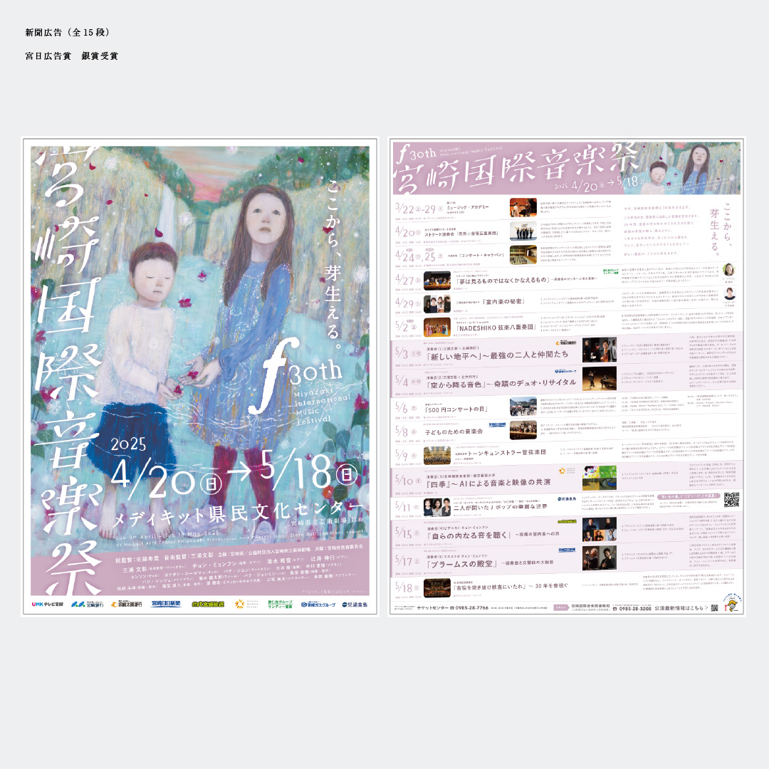
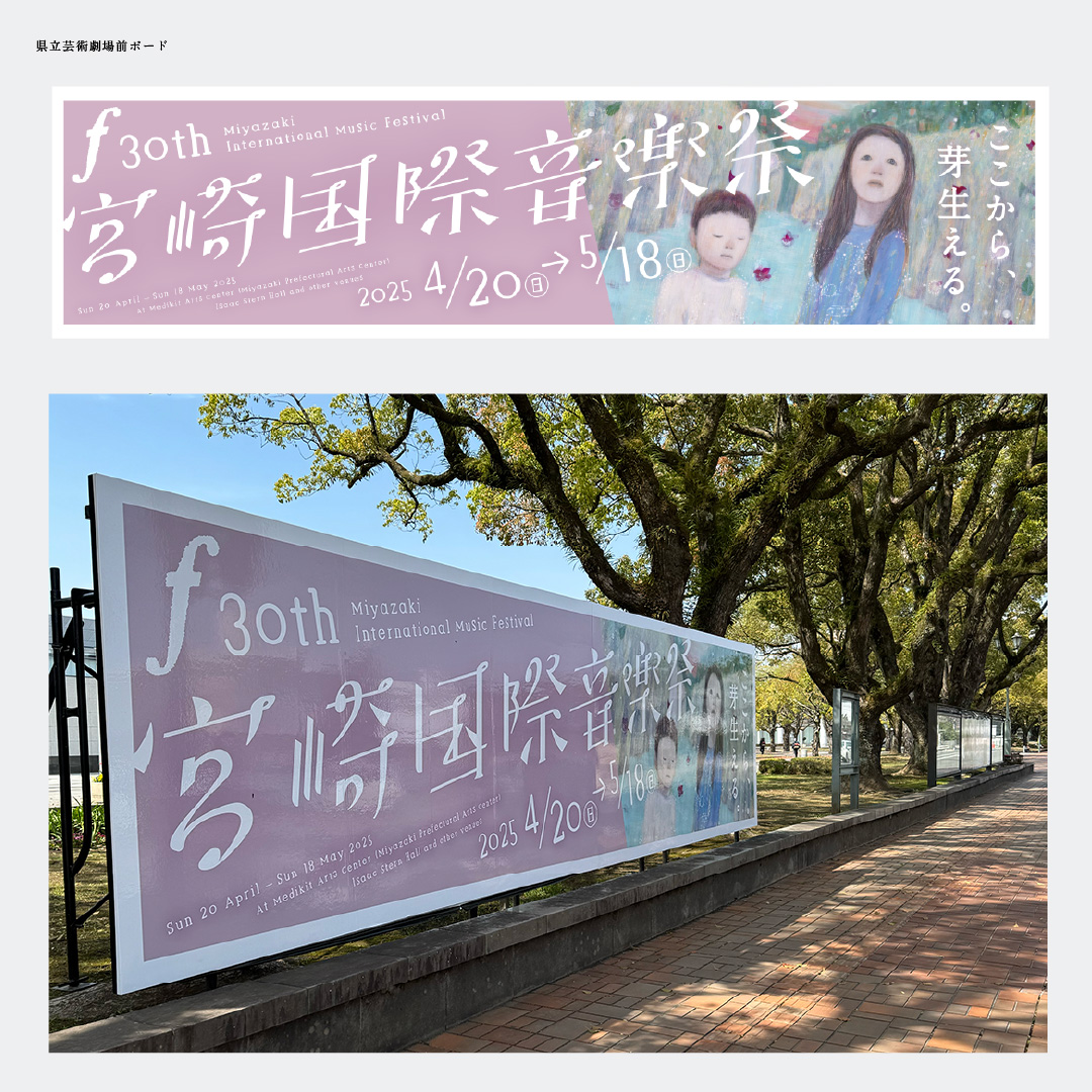
また宮日広告賞を受賞した新聞広告では、プログラムを斜めに配置することで動きをつけ、「おごそかなコンサート」という堅苦しい雰囲気を払拭しました。
こうして、これまでの堅苦しい「おごそかなコンサート」という堅苦しい雰囲気を払拭することで、当日は昨年まで見られなかったような若い世代がたくさん足を運んでくれていました。また、例年売れ残っていたグッズについてもすべてほぼ完売に近い状態でTシャツは追加発注もしたほどだったとのことです。
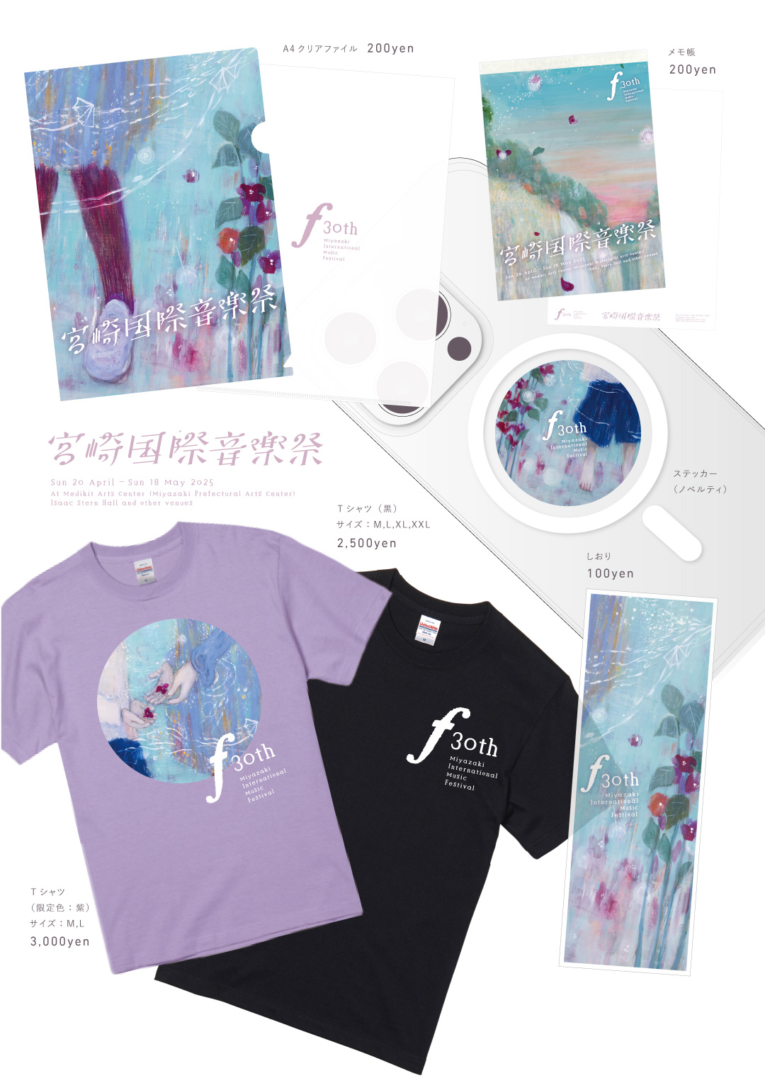
メインビジュアルをはじめ、こうしたアートの一部を切り取ってグッズにすることを了承してくださった、すうひゃん。さんにはリスペクトしかありません。彼女のおかげで、それぞれがアーティストとして、デザイナーとして、しっかりと仕事を全うできたと思います。
彼女の作品に対する想い、そして制作風景は以下よりご覧いただけます。
最後になりますが、このお仕事で痛感したことを問題定義します。
30年後の音楽祭の未来を見据え、彼女と私は全力でこの仕事に向き合いましたが、どうやら今回だけの使い捨てで終わるようです。
公式な理由はきっと最後まで出ることはありませんが、「音楽監督が変わるから」と聞いています。新しい音楽監督は若い東京の方であり、その方が懇意にしている東京のアーティストに頼む様子。
もちろん、その音楽監督にも確固たる考えがあるのかもしれません。私よりももっと素晴らしいデザイナーの手によって、若い世代がこぞって訪れるような音楽祭になっていけばそれに越したことはありません。
しかし一度決めた方針がたった一年で変わっていくとしたら、一体次はどこを目指していくのか。
「これからの音楽祭を考えてほしい」と依頼し、全身全霊で応えたことに対して、菓子折りひとつで一方的に使い捨てにしてしまう。地方のアーティストやデザイナーを育てていく機関として、本当にそれでいいのか。
私は疑問を持たずにいられません。
本質的なところではなく、権力による脈略のない鶴の一声で全部変わってしまうのは業界的には「よくある話」。こうしたことは25年のキャリアのなかでさんざん経験してきました。ただ、そのたびに「よくある話」で片付けてきたことの弊害がどれだけ大きいか、今一度考えてみる必要があります。
地方でアートやデザインがなかなか育たないのはなぜなのか。それが育たないことによってどれだけの弊害が生まれているのか。
地方では、本質的なことよりも人間関係や権力関係が優先されるのが一般的です(都会でももちろんそういったことはあります)。信念をもってそれに逆らうと、狭い地方では逃げ場もなく、たちまち生きていけなくなってしまいます。
私が横浜から地方に来て一番言われるのは「波風を立てないでください」ということ。いいものを作ることが第一義でやってきた私にとって、クライアントの期待値を超えるのが仕事だと思っていましたが、それは「波風」として迷惑がられてしまう。「もうお客さんこれでいいって言ってるんだから。ね。」となだめられる。中途半端な内容、クオリティがちょうどよく、「今までにない」は逆に嫌がられる。
こうした行政の施策においては、「地方のアート・デザインを育てていく」といった本質からはずれ、「開催すること」が目的になってしまう。そうしたことが繰り返されることで、若者たちは都会に流れ、せっかく国から地方の芸術を育てるために降りてきたお金はまた、都会のデザイナーやアーティストに支払われていく。
地方にも素晴らしいアーティストがたくさんいます。結局、アート・デザインが理解できない層にとっては内容は関係なく、「都会の人」というだけで受け入れられやすい。それを選んだことにクレームも来ない。いつまでたっても地方のアーティストは日の目を見ることなく、活動の場所もない。これで地方のアート・デザインが育つわけがありません。
こうなってしまった原因は私たちにあるのではないか。
ものづくりをする人間にとって、裏側を見せることは「みっともないこと」としてタブーとされてきました。こうしたことを書くと「別の人に頼まれたのが悔しいから書いてる」ようにも見えてみっともないからです。だからこそ、デザイナーは表に出ることなく、いくら賞を受賞しても名前が出ないことをよしとしてきました。自分のカラーは出さない。それがデザイナーとしての誇りでした。クロコに徹することが美徳とされてきました。
一方で我々の先輩にあたるデザイナーたちはそうしたことを上手にこなしてきた気がします。アワードを自分たちで作り、それを互いに評して、素晴らしかったものには毎年賞を与える。私自身そういったものに憧れてデザインの道に入ったのです。
こうした地道な活動がデザイナーの職業価値をあげていた一方で、最終的には「仲良しグループの褒め合い」にもなり、本来のクライアントであるはずのエンドユーザーも忘れられ、まるで業界がクライアントであるかのような一辺倒なデザインや、賞をとるためのおかしな作品があふれていったのも事実です。
そうした弊害を見てきた私たちの世代は、自分たちをよく見せることをむしろ「悪徳」とし、あまりに職人に徹しすぎたのだと、今になっては思います。だからこそ、今日この文章を勇気をもって書いています。
さまざまなアプリケーションやAIが登場し「デザインは無料でつくるもの」「デザイナーに頼むのはもったいない」という時代になり、アプリケーションを使いこなすことがデザインをすることだと思っている方も少なくなりません。
先輩に殴られたり蹴られたり、つまらない愚痴をさんざん酒の肴にされながら聞かされ、毎日明け方まで働いて得られたもの。それは子々孫々、脈々と受け継がれてきた「技巧」であるにもかかわらず、理解されることもないまま、後進に受け継がれることなく終わっていく。
「残念だ」「わかってない」とぼやきながら死んでいっていいのか。
そうしないためには、まず職業価値をあげていくこと。「おかしい」と思ったことを「おかしい」と発言し、「よくある話」と笑って慰め合う、おかしな慣習をなくすことかもしれません。
この文章はあたらしい音楽監督を責めるものでもありませんし、主催である宮崎県立芸術劇場を責めるものではありません。ただただ、こうした負のループを終わらせなければならない、それが私たちの世代に課せられた使命だと思うから。
何も発言しない「自分のための」美徳よりも、デザインやアートという、人類がずっと大切にしてきたものをしっかりと次の世代に渡していくために。
ArtDirection, Design, Typography : Junichi Kato
Artwork : Soohyang
